#mylifeindiptychs
I have been meaning to write a blog post about my diptych project for a few weeks, but never got to it. There is always so much to do. Since I feel I am coming to the end of my project, I better do it now or it will never happen.
Sometime in November I was inspired by Cindy Cavanagh’s beautiful blog post and I just LOVED the way her diptychs were telling stories, so, out of the blue I announced I would be sharing diptychs.
The first weeks were agonisingly hard. Finding two images that work together was so much harder than I thought. Shooting vertical was all new as well.
Making colours, lines and shapes of two images work as a “whole” was so much harder than anticipated, but I LOVE that it pushed me to think about my composition and forced me to look at my images with new eyes. It definitely pushed me through the winter. It will be spring in a few days and I am excited to start shooting more colours and can’t wait for some pretty sunlight.
I wanted to share a few of my favourite diptychs with a few notes of what stands out and why I think they ”work”, now obviously this is really subjective and maybe they do not work at all, but this is art. We all have different opinions, so I will just share mine.
I will share a diptych and a few thoughts under it, sometimes I may not have any comments, but just want to share.
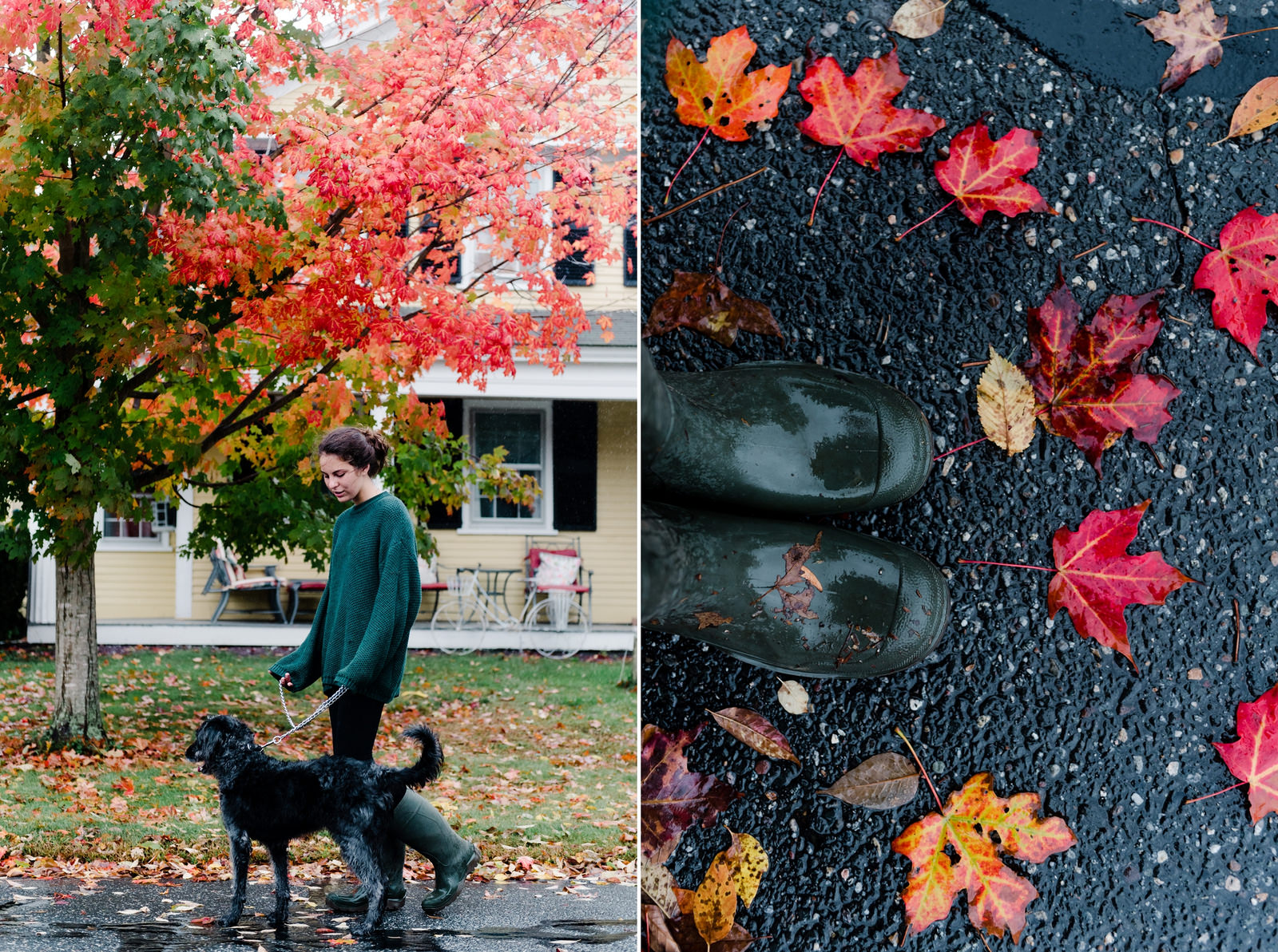
I love that this created a circle starting with my girl & dog and going around following the leaves on the ground. The colors all seemed to work. These were film images shot on Portra if I remember right.
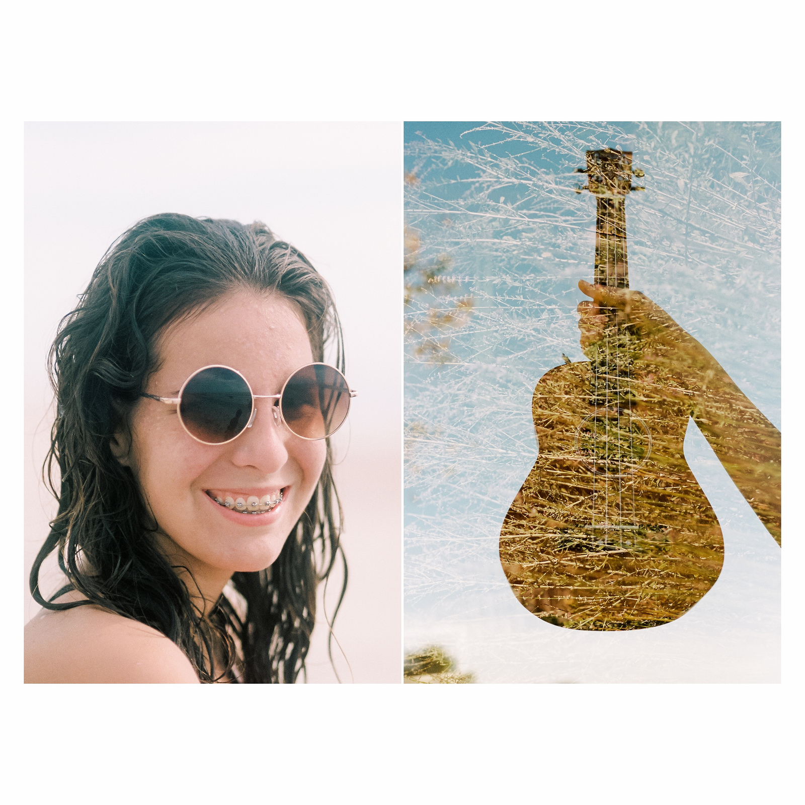
This is another film collage and I just loved that it told the story of my 15 yr old: The beach, the sun, the braces, the sunnies, the ukulele. Her favorite things in life.
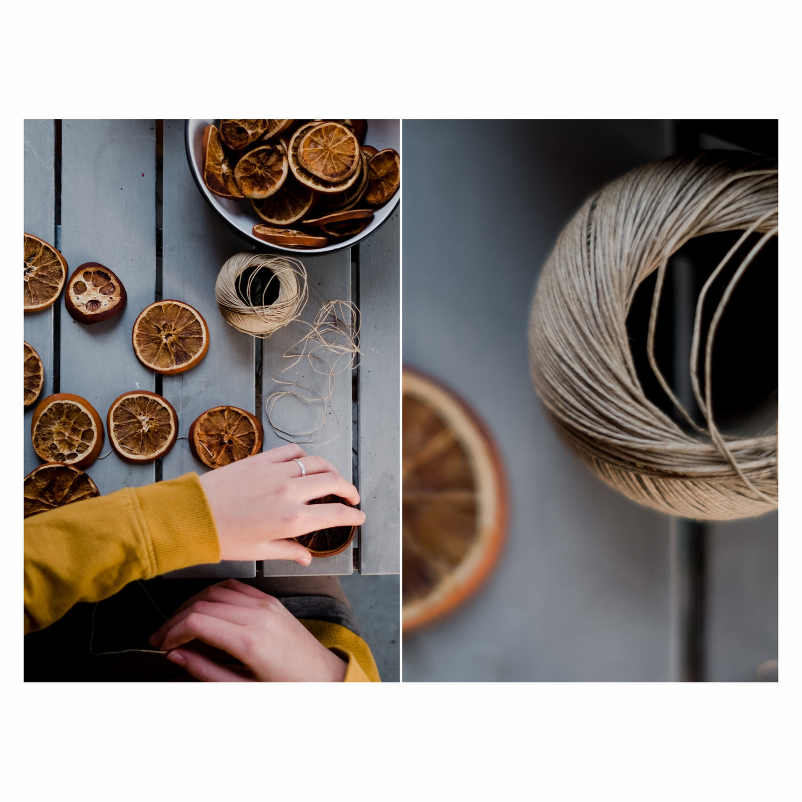
I wanted the detail of the twine, I loved the circle and tried to hone in on the circles VS the straight lines of the table. The yellow/orange and the blue/grey were the reason I started to shoot these images. I also loved the different textures of the twine and the dried orange.
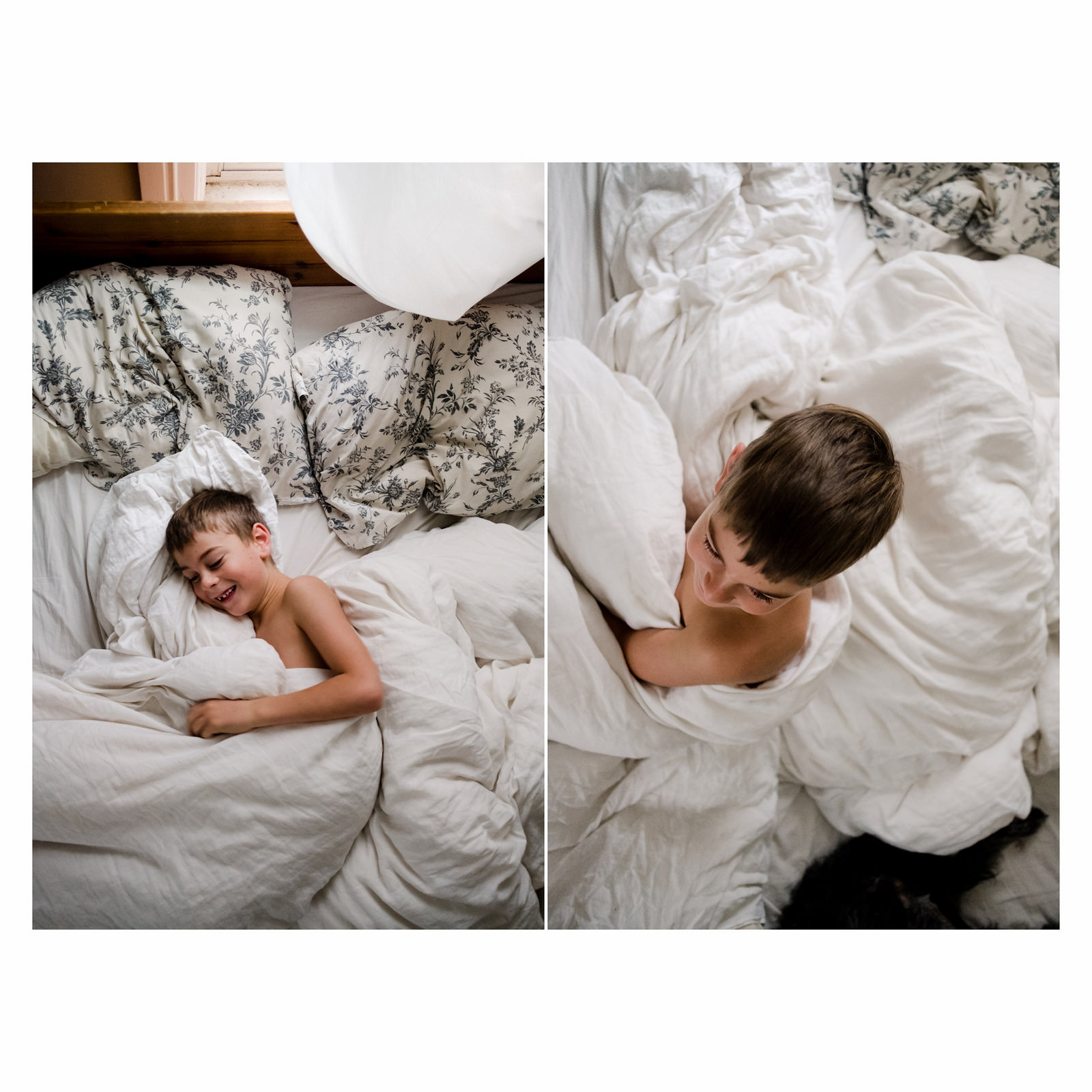
I just loved the simplicity of these two images, it made his happiness and joy stand out. Love the messiness of the bed because it just shows real life with a little boy. The "shape" of the messy bedding just creates movement around him, and adds to the "joy" factor.
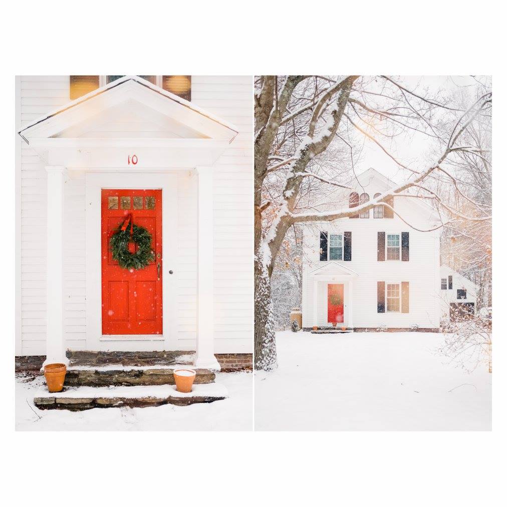
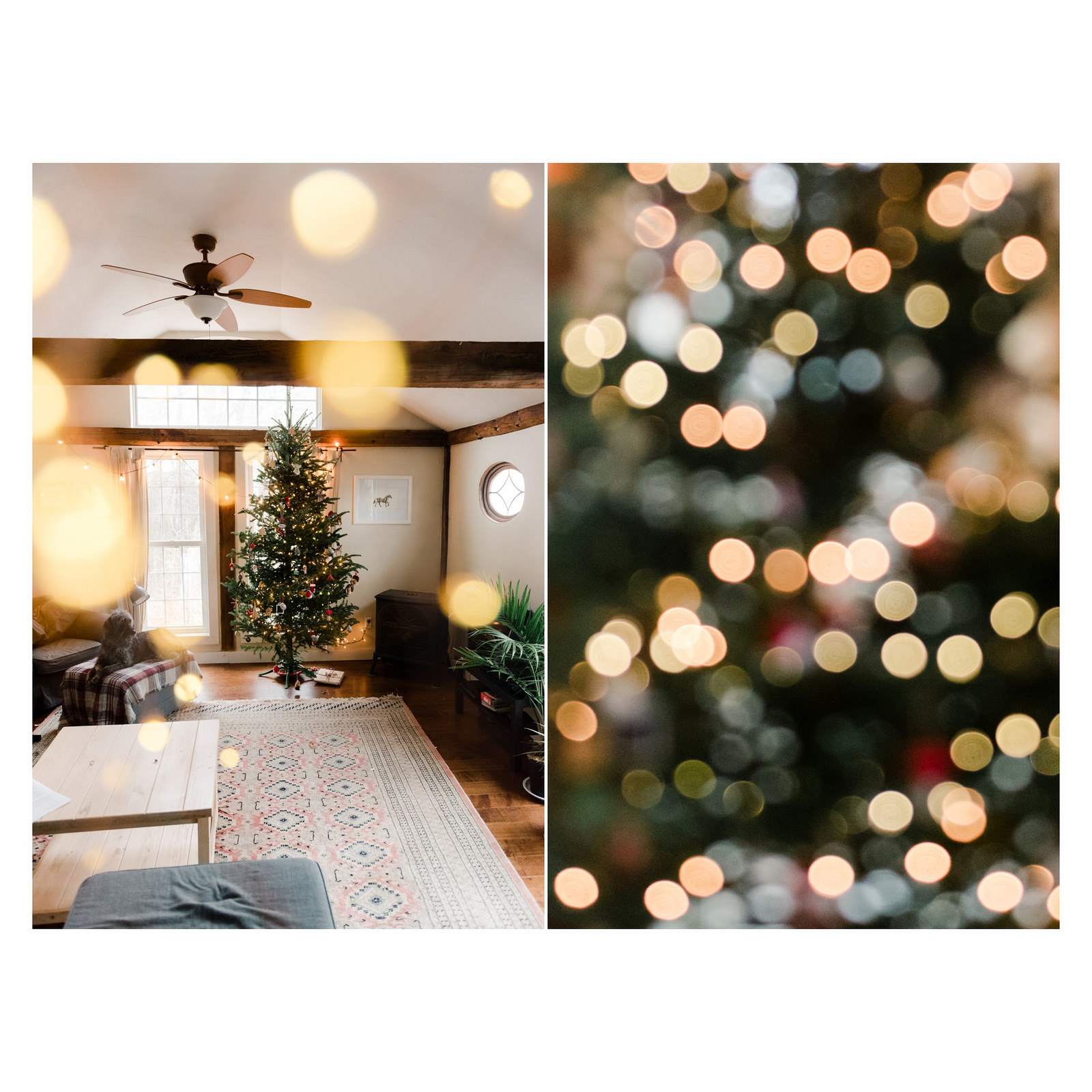
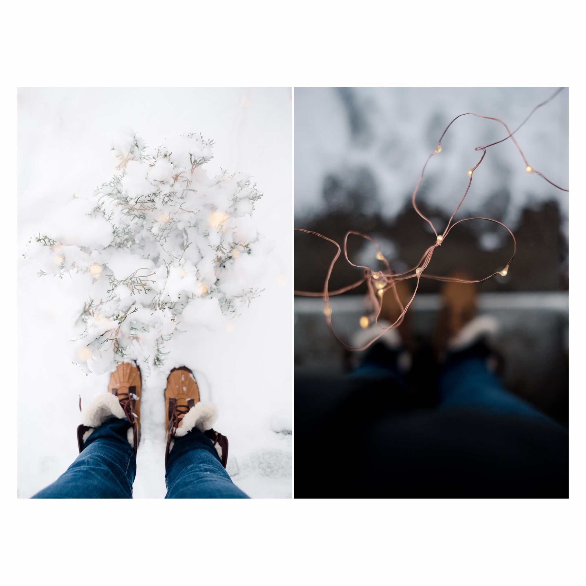
Just because I love my red door on a snow day and love shooting through fairy lights.
I really enjoy the combination of Out of Focus and focused images together.
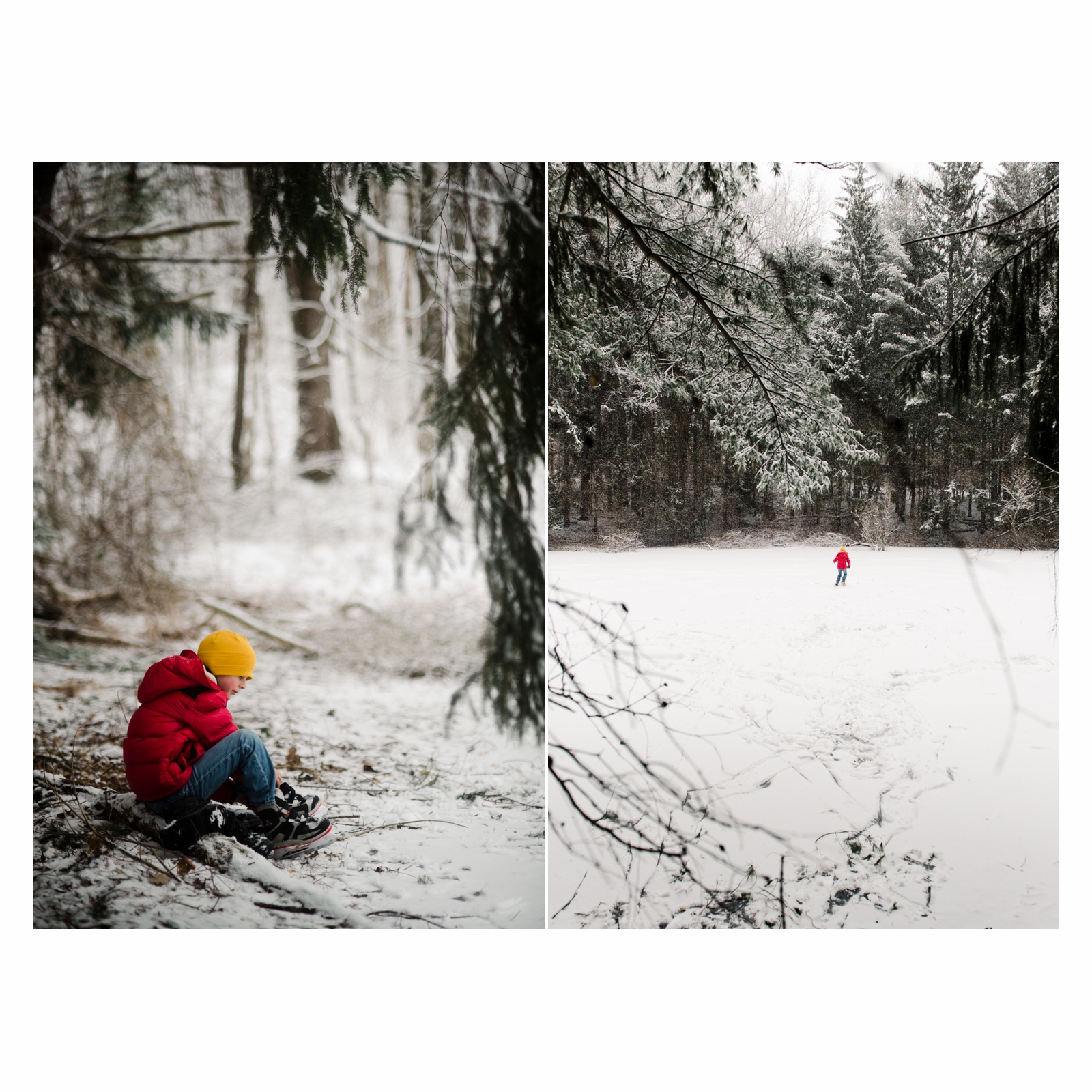
The colors were just what I was looking for. I loved that my little guy looked so little among the trees.
I tried to do a black and white combo with colour for weeks and never quite managed one that I loved. I do love this one, and I think it has to do with the textures.
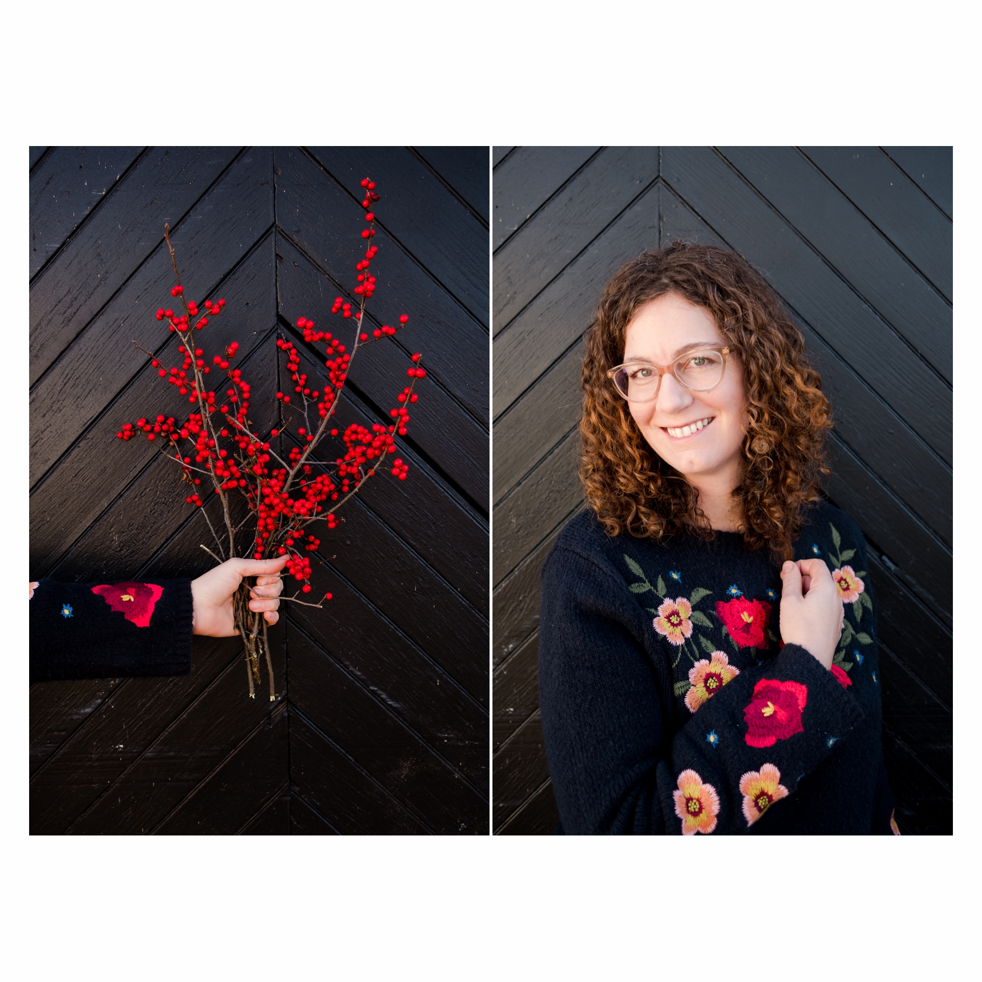
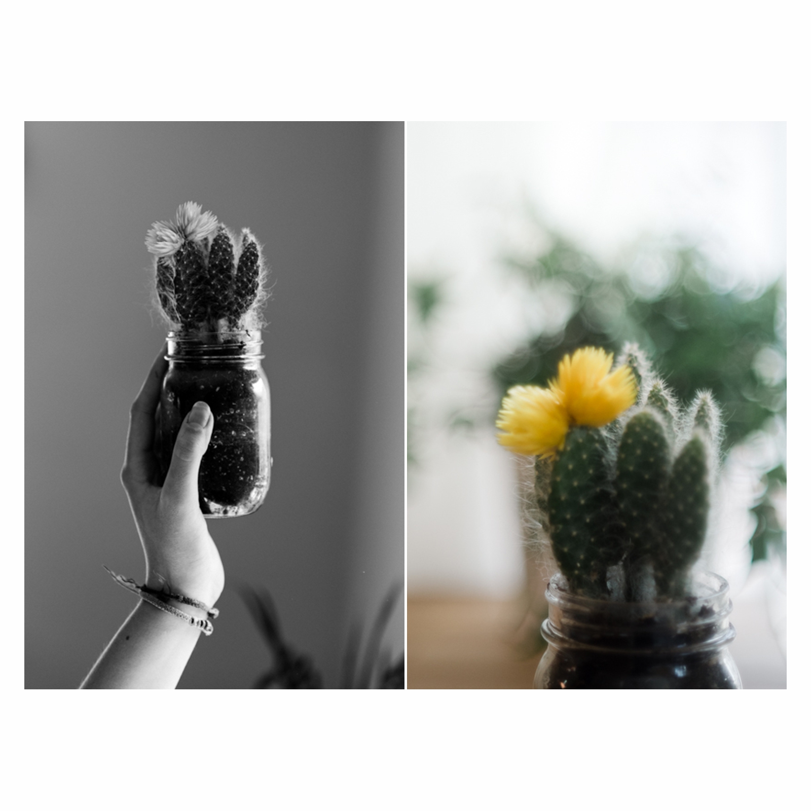
Had to include one of the very rare self portraits I have. I liked how the shape of the berries mimicked the shape of my head. and well, colours!
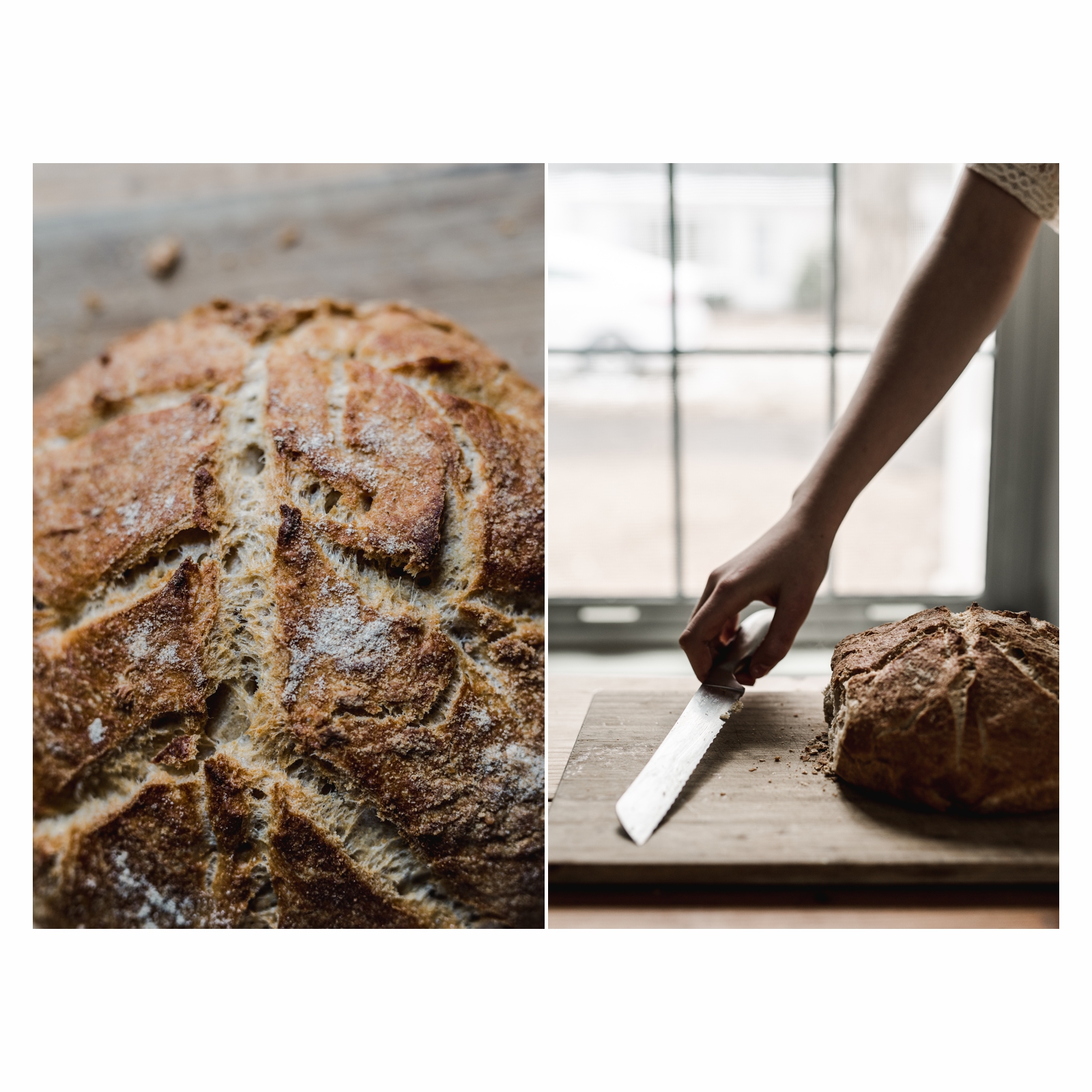
This is one of my favourite. I love how the colours are so harmonious, I love the contrast of texture and smoothness/softness. I love it because it's bread, and YUM.
When I created this diptych I realised how much liked the contrast of light and dark. The subject is the same but the focus is different. This is one of my favourite too.
Freelensing makes everything so dreamy, and shooting in snow can be really hard and harsh. I wanted this to feel soft and dreamy. I love how the shadows meet in the middle. I love how the focus is on the legs. My daughter's long legs and Stormy's legs.
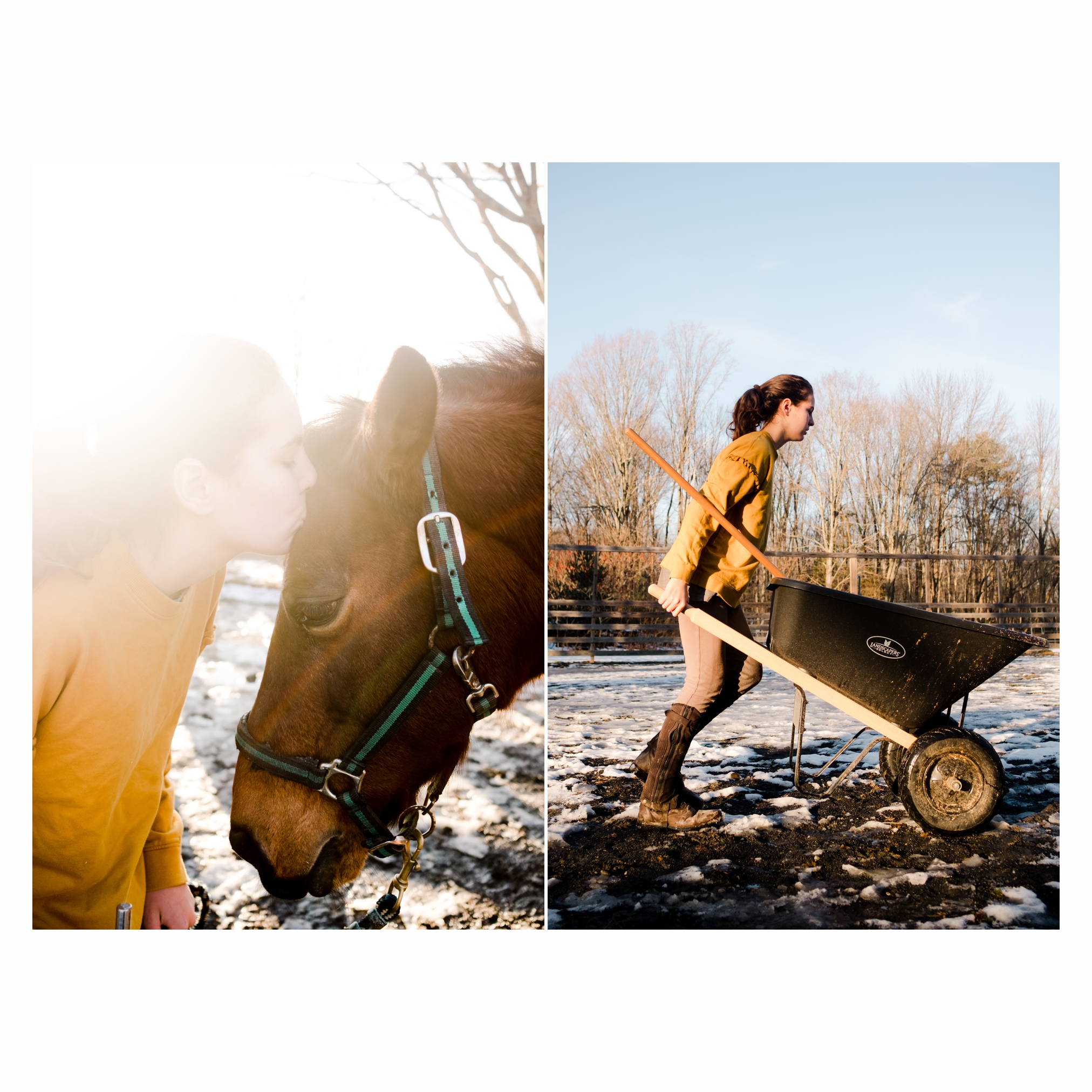
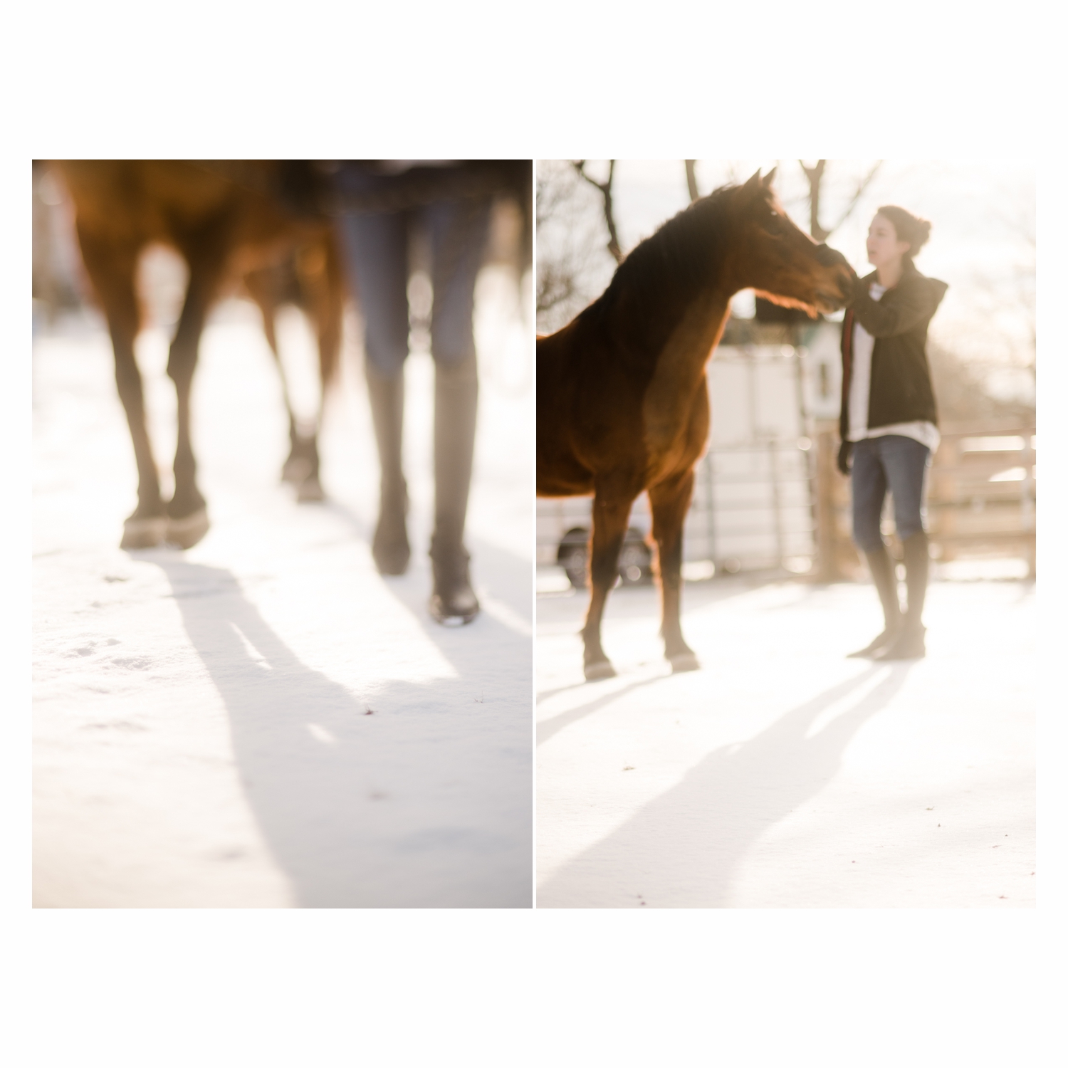
Another horse photo, because that's what we do three times a week. See how Noa's body when she pushes the wheelbarrow mimics the horse nose. I love that. I also liked, and I sure all horse loving people will relate, horses is about love and hard work, and the two images together portray that well. Also that light!
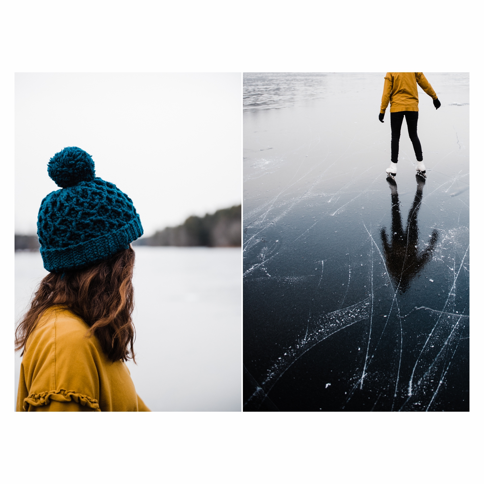
Again I love the contrast of dark and light. The subject being bottom left and top right: I think it creates tension, that brings our eyes around. Of course I lucked out with the colours here, the hat and the ice were the same colours and I tried to ring it out even more in my edit. The leading lines of the ice were also perfect. I totally lucked out with these two images, and was delighted when I tried them together :-)
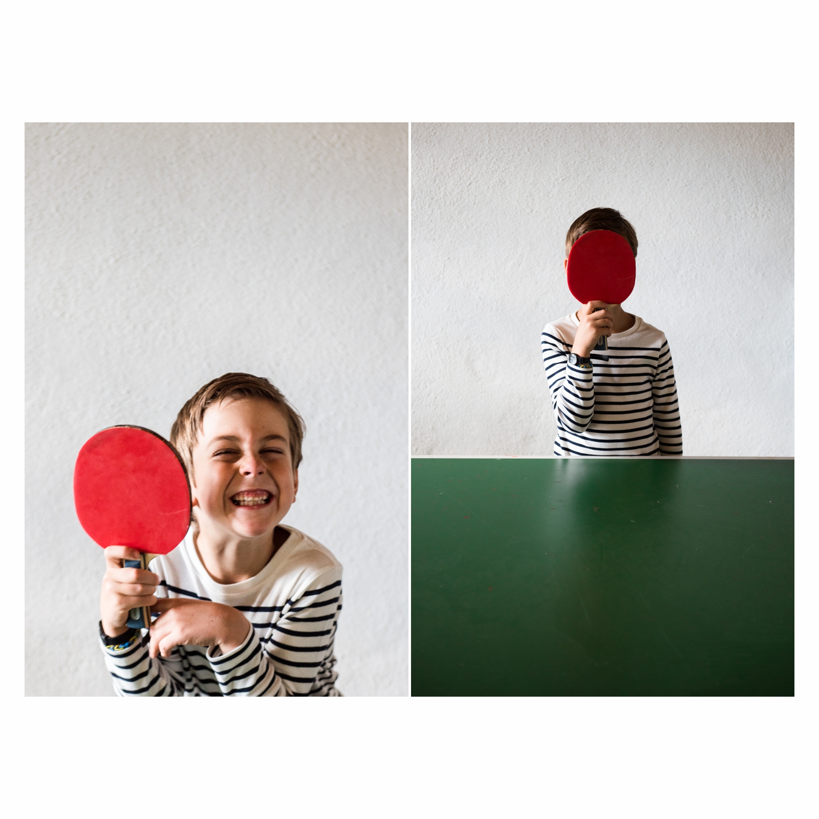
I worked on these two images when I was taking Roxanne's Editing for Artist (through Illuminate Classes) and the main story here is the colours, red and green being complementary colours. I love the contrast of the (red) circle and the lines as well. It's all "lines" except for the paddle & his head.

This last one were iPhone pics from a ski trip. The story of going home late and being exhausted, the blurriness emphasises that story. I love the leading lines in both.
I think I will stop sharing here, but if you want to see more diptychs, visit my instagram @leajonesphoto and the hashtag #mylifeindiptychs to see my friends' beautiful work , I hope this inspired you to start your own project, whether it's diptychs or anything that appeals to you right now, this project has brought so many new friends in my life and I LOVED having my own project to work on through the long New England winter. Thanks to all that have encouraged me, and shared some love, it meant the world to me.
xxx
Léa
